
# 14.4 【可视化之matplotlib】难点:子图与子区
在 matplotlib 中有两个非常重要,而且很容易混淆的概念,一个是 subplot,一个是axes。这两个概念将贯穿整个 matplotlib 学习历程。在往后进行深度研究之前呢,务必要先弄懂这两个概念,否则将后面的绘制代码,我相信你一定会一头雾水的。
在查阅了一些相关中文文档后,我暂且将 subplot 称为 子区,而将 axes 称之为 子图。这些只是为了方便后续的描述。
你会发现,即使翻译成中文后,还是无法帮助我们直观的理解这两个概念。因此我特地画了几张图,来解释这两者到底是啥区别。
## 1. 子区
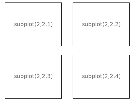
子区(subplot),是基于 网格(grid)来规划的。
比如,这个写法
```python
plt.subplot(2, 2, 1)
```
是将当前图像(figure)按 2 行 2 列的布局进行分割,然后取索引为 1 的子图。注意 matlibplot 是完全借鉴了 MATLAB 的思想,所以的起始索引为 1,不像 Python 的起始索引为 0。
他有好几种写法,这里写我在官网学到的几个方法。
这几种写法是等价的。
```python
# 第一种写法
ax = plt.subplot(2, 2, 1)
# 第二种写法
ax = plt.subplot2grid((2, 2), (0, 0))
# 第三种写法: GridSpec
import matplotlib.gridspec as gridspec
gs = gridspec.GridSpec(2, 2)
ax = plt.subplot(gs[0, 0])
```
这第二种写法呢,是将图像分成 2 行 2 列,再取 第 0 索引行(第一行),第 0 索引列(第一列)。
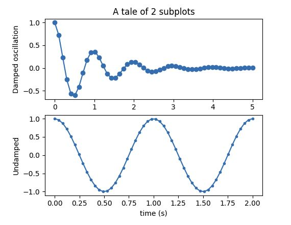
学完了以上内容,我们来使用最简单的方法(第一种)来实践一下。
```python
import numpy as np
import matplotlib.pyplot as plt
def fig(t):
return np.exp(-t) * np.cos(2*np.pi*t)
t1 = np.arange(0.0, 5.0, 0.1)
t2 = np.arange(0.0, 5.0, 0.02)
plt.figure(1)
# 等同于 plt.subplot(2, 1,1)
plt.subplot(211)
plt.plot(t1, fig(t1), 'bo', t2, fig(t2), 'k')
# 等同于 plt.subplot(2, 1,2)
plt.subplot(212)
plt.plot(t2, np.cos(2*np.pi*t2), 'r--')
plt.show()
```
## 2. 子图
子图(axes),和子区(subplot)非常相似,一个子图可能是由一个或多个子区域构成的。它比子区更加灵活。
它可以是这样
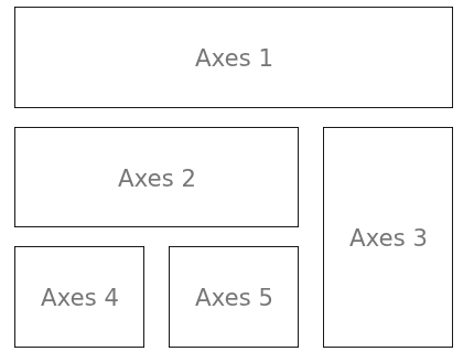
要实现如上这个效果。常用的有两种方法。
第一种,使用 `subplot2grid`
```python
axes1 = plt.subplot2grid((3, 3), (0, 0), colspan=3)
axes2 = plt.subplot2grid((3, 3), (1, 0), colspan=2)
axes3 = plt.subplot2grid((3, 3), (1, 2), rowspan=2)
axes4 = plt.subplot2grid((3, 3), (2, 0))
axes5 = plt.subplot2grid((3, 3), (2, 1))
```
第二种,使用 `GridSpec` (可以切片)
```python
import matplotlib.gridspec as gridspec
gs = gridspec.GridSpec(3, 3)
ax1 = plt.subplot(gs[0, :])
ax2 = plt.subplot(gs[1, :-1])
ax3 = plt.subplot(gs[1:, -1])
ax4 = plt.subplot(gs[-1, 0])
ax5 = plt.subplot(gs[-1, -2])
```
这个比较规则的划分我们举个例子看看。

代码如下:
```python
import numpy as np
import matplotlib.pyplot as plt
def f(t):
return np.exp(-t) * np.cos(2*np.pi*t)
t1 = np.arange(0.0, 3.0, 0.01)
ax1 = plt.subplot(212)
ax1.margins(0.05) # Default margin is 0.05, value 0 means fit
ax1.plot(t1, f(t1), 'k')
ax2 = plt.subplot(221)
ax2.margins(2, 2) # Values >0.0 zoom out
ax2.plot(t1, f(t1), 'r')
ax2.set_title('Zoomed out')
ax3 = plt.subplot(222)
ax3.margins(x=0, y=-0.25) # Values in (-0.5, 0.0) zooms in to center
ax3.plot(t1, f(t1), 'g')
ax3.set_title('Zoomed in')
plt.show()
```
为什么说,子图的灵活性更高呢,因为它允许把图片放置到图像(figure)中的任何地方(如下图)。所以如果我们想要在一个大图片中嵌套一个小点的图片,我们通过子图(axes)来完成它。
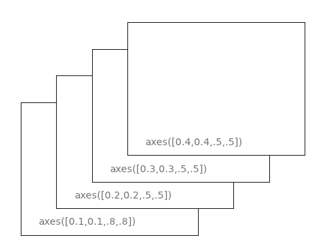
图中的 axes 是如何实现的,刚开始我也有点懵逼,在查阅了官方文档后,我才明白。
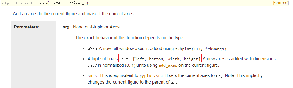
`left` 是指,离左边界的距离。
`bottom` 是指,离底边的距离。
`width` 是指,子图的宽度。
`height` 是指,子图的高度。
以上四个参数,是一个(0, 1)的比例(相比于figure),而不是具体数值。
同样地,这个我们也来看一个例子。
这个图的亮点,在于中间,多了两个子图,就像往图中贴上了两个插画一样。
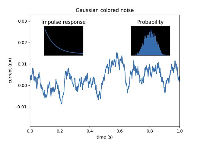
那么这个如何实现呢?
```python
import matplotlib.pyplot as plt
import numpy as np
# Fixing random state for reproducibility
np.random.seed(19680801)
# create some data to use for the plot
dt = 0.001
t = np.arange(0.0, 10.0, dt)
r = np.exp(-t[:1000] / 0.05) # impulse response
x = np.random.randn(len(t))
s = np.convolve(x, r)[:len(x)] * dt # colored noise
# the main axes is subplot(111) by default
plt.plot(t, s)
plt.axis([0, 1, 1.1 * np.min(s), 2 * np.max(s)])
plt.xlabel('time (s)')
plt.ylabel('current (nA)')
plt.title('Gaussian colored noise')
# this is an inset axes over the main axes
a = plt.axes([.65, .6, .2, .2], facecolor='k')
n, bins, patches = plt.hist(s, 400, density=True)
plt.title('Probability')
plt.xticks([])
plt.yticks([])
# this is another inset axes over the main axes
b = plt.axes([0.2, 0.6, .2, .2], facecolor='k')
plt.plot(t[:len(r)], r)
plt.title('Impulse response')
plt.xlim(0, 0.2)
plt.xticks([])
plt.yticks([])
plt.show()
```
---
- 第一章:安装运行
- 1.1 【环境】快速安装 Python 解释器
- 1.2 【环境】Python 开发环境的搭建
- 1.3 【基础】两种运行 Python 程序方法
- 第二章:数据类型
- 2.1 【基础】常量与变量
- 2.2 【基础】字符串类型
- 2.3 【基础】整数与浮点数
- 2.4 【基础】布尔值:真与假
- 2.5 【基础】学会输入与输出
- 2.6 【基础】字符串格式化
- 2.6 【基础】运算符(超全整理)
- 第三章:数据结构
- 3.1 【基础】列表
- 3.2 【基础】元组
- 3.3 【基础】字典
- 3.4 【基础】集合
- 3.5 【基础】迭代器
- 3.6 【基础】生成器
- 第四章:控制流程
- 4.1 【基础】条件语句:if
- 4.2 【基础】循环语句:for
- 4.3 【基础】循环语句:while
- 4.4 【进阶】五种推导式
- 第五章:学习函数
- 5.1 【基础】普通函数
- 5.2 【基础】匿名函数
- 5.3 【基础】高阶函数
- 5.4 【基础】反射函数
- 5.5 【基础】偏函数
- 5.6 【进阶】泛型函数
- 5.7 【基础】变量的作用域
- 5.8 【进阶】上下文管理器
- 5.9 【进阶】装饰器的六种写法
- 第六章:错误异常
- 6.1 【基础】什么是异常?
- 6.2 【基础】如何抛出和捕获异常?
- 6.3 【基础】如何自定义异常?
- 6.4 【进阶】如何关闭异常自动关联上下文?
- 6.5 【进阶】异常处理的三个好习惯
- 第七章:类与对象
- 7.1 【基础】类的理解与使用
- 7.2 【基础】静态方法与类方法
- 7.3 【基础】私有变量与私有方法
- 7.4 【基础】类的封装(Encapsulation)
- 7.5 【基础】类的继承(Inheritance)
- 7.6 【基础】类的多态(Polymorphism)
- 7.7 【基础】类的 property 属性
- 7.8 【进阶】类的 Mixin 设计模式
- 7.9 【进阶】类的魔术方法(超全整理)
- 7.10 【进阶】神奇的元类编程(metaclass)
- 7.11 【进阶】深藏不露的描述符(Descriptor)
- 第八章:包与模块
- 8.1 【基础】什么是包、模块和库?
- 8.2 【基础】安装第三方包的八种方法
- 8.3 【基础】导入单元的构成
- 8.4 【基础】导入包的标准写法
- 8.5 【进阶】常规包与空间命名包
- 8.6 【进阶】花式导包的八种方法
- 8.7 【进阶】包导入的三个冷门知识点
- 8.8 【基础】pip 的超全使用指南
- 8.9 【进阶】理解模块的缓存
- 8.10 【进阶】理解查找器与加载器
- 8.11 【进阶】实现远程导入模块
- 8.12 【基础】分发工具:distutils和setuptools
- 8.13 【基础】源码包与二进制包有什么区别?
- 8.14 【基础】eggs与wheels 有什么区别?
- 8.15 【进阶】超详细讲解 setup.py 的编写
- 8.16 【进阶】打包辅助神器 PBR 是什么?
- 8.17 【进阶】开源自己的包到 PYPI 上
- 第九章:调试技巧
- 9.1 【调试技巧】超详细图文教你调试代码
- 9.2 【调试技巧】PyCharm 中指定参数调试程序
- 9.3 【调试技巧】PyCharm跑完后立即进入调试模式
- 9.4 【调试技巧】脚本报错后立即进入调试模式
- 9.5 【调试技巧】使用 PDB 进行无界面调试
- 9.6 【调试技巧】如何调试已经运行的程序?
- 9.7 【调试技巧】使用 PySnopper 调试疑难杂症
- 9.8 【调试技巧】使用 PyCharm 进行远程调试
- 第十章:并发编程
- 10.1 【并发编程】从性能角度初探并发编程
- 10.2 【并发编程】创建多线程的几种方法
- 10.3 【并发编程】谈谈线程中的“锁机制”
- 10.4 【并发编程】线程消息通信机制
- 10.5 【并发编程】线程中的信息隔离
- 10.6 【并发编程】线程池创建的几种方法
- 10.7 【并发编程】从 yield 开始入门协程
- 10.8 【并发编程】深入理解yield from语法
- 10.9 【并发编程】初识异步IO框架:asyncio 上篇
- 10.10 【并发编程】深入异步IO框架:asyncio 中篇
- 10.11 【并发编程】实战异步IO框架:asyncio 下篇
- 10.12 【并发编程】生成器与协程,你分清了吗?
- 10.14 【并发编程】浅谈线程安全那些事儿
- 第十二章:虚拟环境
- 12.1 【虚拟环境】为什么要有虚拟环境?
- 12.2 【虚拟环境】方案一:使用 virtualenv
- 12.3 【虚拟环境】方案二:使用 pipenv
- 12.4 【虚拟环境】方案三:使用 pipx
- 12.5 【虚拟环境】方案四:使用 poetry
- 第十三章:绝佳工具
- 13.1 【静态检查】mypy 的使用
- 13.2 【代码测试】pytest 的使用
- 13.3 【代码提交】pre-commit hook
- 13.4 【项目生成】cookiecutter 的使用
- 第十四章:数据可视化
- 14.1 【可视化之matplotlib】一图带你入门matplotlib
- 14.2 【可视化之matplotlib】详解六种可视化图表
- 14.3 【可视化之matplotlib】 绘制正余弦函数图象
- 14.4 【可视化之matplotlib】难点:子图与子区
- 14.5 【可视化之matplotlib】绘制酷炫的gif动态图
- 14.6 【可视化之matplotlib】自动生成图像视频
- 14.7 【可视化神器】最高级的可视化神器: plotly_express