
#### 6.2.2 ShapeDrawable
ShapeDrawable是一种很常见的Drawable,可以理解为通过颜色来构造的图形,它既可以是纯色的图形,也可以是具有渐变效果的图形。ShapeDrawable的语法稍显复杂,如下所示。
<? xml version="1.0" encoding="utf-8"? >
<shape
xmlns:android="http://schemas.android.com/apk/res/android"
android:shape=["rectangle" | "oval" | "line" | "ring"] >
<corners
android:radius="integer"
android:topLeftRadius="integer"
android:topRightRadius="integer"
android:bottomLeftRadius="integer"
android:bottomRightRadius="integer" />
<gradient
android:angle="integer"
android:centerX="integer"
android:centerY="integer"
android:centerColor="integer"
android:endColor="color"
android:gradientRadius="integer"
android:startColor="color"
android:type=["linear" | "radial" | "sweep"]
android:useLevel=["true" | "false"] />
<padding
android:left="integer"
android:top="integer"
android:right="integer"
android:bottom="integer" />
<size
android:width="integer"
android:height="integer" />
<solid
android:color="color" />
<stroke
android:width="integer"
android:color="color"
android:dashWidth="integer"
android:dashGap="integer" />
</shape>
需要注意的是<shape>标签创建的Drawable,其实体类实际上是GradientDrawable,下面分别介绍各个属性的含义。
android:shape
表示图形的形状,有四个选项:rectangle(矩形)、oval(椭圆)、line(横线)和ring(圆环)。它的默认值是矩形,另外line和ring这两个选项必须要通过<stroke>标签来指定线的宽度和颜色等信息,否则将无法达到预期的显示效果。
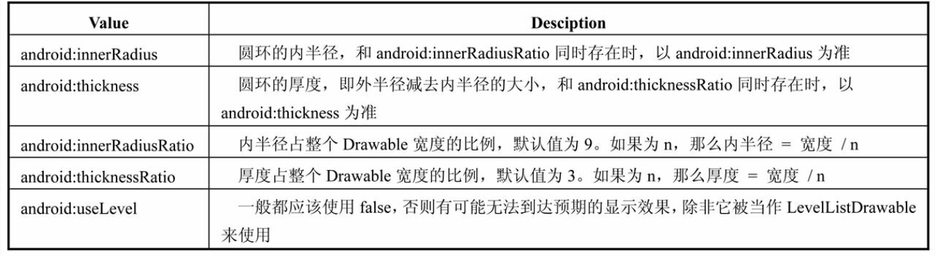
针对ring这个形状,有5个特殊的属性:android:innerRadius、android:thickness、android:innerRadiusRatio、android:thicknessRatio和android:useLevel,它们的含义如表6-2所示。
:-: 表6-2 ring的属性值
`<corners>
`
表示shape的四个角的角度。它只适用于矩形shape,这里的角度是指圆角的程度,用px来表示,它有如下5个属性:
* · android:radius——为四个角同时设定相同的角度,优先级较低,会被其他四个属性覆盖;
* · android:topLeftRadius——设定最上角的角度;
* · android:topRightRadius——设定右上角的角度;
* · android:bottomLeftRadius——设定最下角的角度;
* · android:bottomRightRadius——设定右下角的角度。
`<gradient>
`
它与<solid>标签是互相排斥的,其中solid表示纯色填充,而gradient则表示渐变效果,gradient有如下几个属性:
* android:angle——渐变的角度,默认为0,其值必须为45的倍数,0表示从左到右,90表示从下到上,具体的效果需要自行体验,总之角度会影响渐变的方向;
* · android:centerX——渐变的中心点的横坐标;
* · android:centerY——渐变的中心点的纵坐标,渐变的中心点会影响渐变的具体效果;
* · android:startColor——渐变的起始色;
* · android:centerColor——渐变的中间色;
* · android:endColo——渐变的结束色;
* · android:gradientRadius——渐变半径,仅当android:type= "radial"时有效;
* · android:useLevel——一般为false,当Drawable作为StateListDrawable使用时为true;
* · android:type——渐变的类别,有linear(线性渐变)、radial(径向渐变)、sweep(扫描线渐变)三种,其中默认值为线性渐变,它们三者的区别如图6-3所示。
:-: 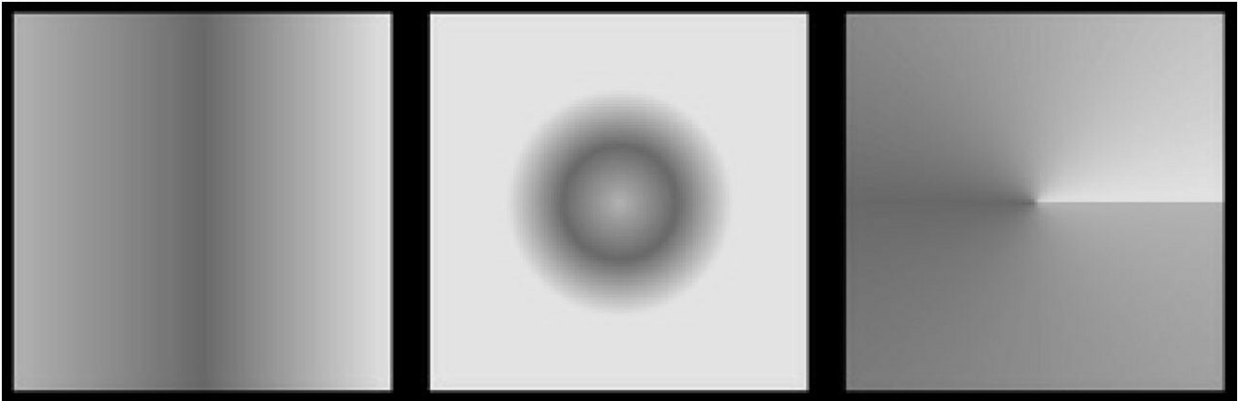
图6-3 渐变的类别,从左到右依次为linear、radial、sweep
`<solid>
`
这个标签表示纯色填充,通过android:color即可指定shape中填充的颜色。
`<stroke>
`
Shape的描边,有如下几个属性:
* · android:width——描边的宽度,越大则shape的边缘线就会看起来越粗;
* · android:color——描边的颜色;
* · android:dashWidth——组成虚线的线段的宽度;
* android:dashGap——组成虚线的线段之间的间隔,间隔越大则虚线看起来空隙就越大。
注意如果android:dashWidth和android:dashGap有任何一个为0,那么虚线效果将不能生效。下面是一个具体的例子,效果图如图6-4所示。
:-: 
图6-4 shape的描边效果
<? xml version="1.0" encoding="utf-8"? >
<shape xmlns:android="http://schemas.android.com/apk/res/android"
android:shape="rectangle" >
<solid android:color="#ff0000" />
<stroke
android:dashGap="2dp"
android:dashWidth="10dp"
android:width="2dp"
android:color="#00ff00" />
</shape>
`<padding>
`
这个表示空白,但是它表示的不是shape的空白,而是包含它的View的空白,有四个属性:android:left、android:top、android:right和android:bottom。
`<size>
`
shape的大小,有两个属性:android:width和android:height,分别表示shape的宽/高。这个表示的是shape的固有大小,但是一般来说它并不是shape最终显示的大小,这个有点抽象,但是我们要明白,对于shape来说它并没有宽/高的概念,作为View的背景它会自适应View的宽/高。我们知道Drawable的两个方法getIntrinsicWidth和getIntrinsicHeight表示的是Drawable的固有宽/高,对于有些Drawable比如图片来说,它的固有宽/高就是图片的尺寸。而对于shape来说,默认情况下它是没有固有宽/高这个概念的,这个时候getIntrinsicWidth和getIntrinsicHeight会返回-1,但是如果通过`<size>`标签来指定宽/高信息,那么这个时候shape就有了所谓的固有宽/高。因此,总结来说,`<size>`标签设置的宽/高就是ShapeDrawable的固有宽/高,但是作为View的背景时,shape还会被拉伸或者缩小为View的大小。
- 前言
- 第1章 Activity的生命周期和启动模式
- 1.1 Activity的生命周期全面分析
- 1.1.1 典型情况下的生命周期分析
- 1.1.2 异常情况下的生命周期分析
- 1.2 Activity的启动模式
- 1.2.1 Activity的LaunchMode
- 1.2.2 Activity的Flags
- 1.3 IntentFilter的匹配规则
- 第2章 IPC机制
- 2.1 Android IPC简介
- 2.2 Android中的多进程模式
- 2.2.1 开启多进程模式
- 2.2.2 多进程模式的运行机制
- 2.3 IPC基础概念介绍
- 2.3.1 Serializable接口
- 2.3.2 Parcelable接口
- 2.3.3 Binder
- 2.4 Android中的IPC方式
- 2.4.1 使用Bundle
- 2.4.2 使用文件共享
- 2.4.3 使用Messenger
- 2.4.4 使用AIDL
- 2.4.5 使用ContentProvider
- 2.4.6 使用Socket
- 2.5 Binder连接池
- 2.6 选用合适的IPC方式
- 第3章 View的事件体系
- 3.1 View基础知识
- 3.1.1 什么是View
- 3.1.2 View的位置参数
- 3.1.3 MotionEvent和TouchSlop
- 3.1.4 VelocityTracker、GestureDetector和Scroller
- 3.2 View的滑动
- 3.2.1 使用scrollTo/scrollBy
- 3.2.2 使用动画
- 3.2.3 改变布局参数
- 3.2.4 各种滑动方式的对比
- 3.3 弹性滑动
- 3.3.1 使用Scroller7
- 3.3.2 通过动画
- 3.3.3 使用延时策略
- 3.4 View的事件分发机制
- 3.4.1 点击事件的传递规则
- 3.4.2 事件分发的源码解析
- 3.5 View的滑动冲突
- 3.5.1 常见的滑动冲突场景
- 3.5.2 滑动冲突的处理规则
- 3.5.3 滑动冲突的解决方式
- 第4章 View的工作原理
- 4.1 初识ViewRoot和DecorView
- 4.2 理解MeasureSpec
- 4.2.1 MeasureSpec
- 4.2.2 MeasureSpec和LayoutParams的对应关系
- 4.3 View的工作流程
- 4.3.1 measure过程
- 4.3.2 layout过程
- 4.3.3 draw过程
- 4.4 自定义View
- 4.4.1 自定义View的分类
- 4.4.2 自定义View须知
- 4.4.3 自定义View示例
- 4.4.4 自定义View的思想
- 第5章 理解RemoteViews
- 5.1 RemoteViews的应用
- 5.1.1 RemoteViews在通知栏上的应用
- 5.1.2 RemoteViews在桌面小部件上的应用
- 5.1.3 PendingIntent概述
- 5.2 RemoteViews的内部机制
- 5.3 RemoteViews的意义
- 第6章 Android的Drawable
- 6.1 Drawable简介
- 6.2 Drawable的分类
- 6.2.1 BitmapDrawable2
- 6.2.2 ShapeDrawable
- 6.2.3 LayerDrawable
- 6.2.4 StateListDrawable
- 6.2.5 LevelListDrawable
- 6.2.6 TransitionDrawable
- 6.2.7 InsetDrawable
- 6.2.8 ScaleDrawable
- 6.2.9 ClipDrawable
- 6.3 自定义Drawable
- 第7章 Android动画深入分析
- 7.1 View动画
- 7.1.1 View动画的种类
- 7.1.2 自定义View动画
- 7.1.3 帧动画
- 7.2 View动画的特殊使用场景
- 7.2.1 LayoutAnimation
- 7.2.2 Activity的切换效果
- 7.3 属性动画
- 7.3.1 使用属性动画
- 7.3.2 理解插值器和估值器 /
- 7.3.3 属性动画的监听器
- 7.3.4 对任意属性做动画
- 7.3.5 属性动画的工作原理
- 7.4 使用动画的注意事项
- 第8章 理解Window和WindowManager
- 8.1 Window和WindowManager
- 8.2 Window的内部机制
- 8.2.1 Window的添加过程
- 8.2.2 Window的删除过程
- 8.2.3 Window的更新过程
- 8.3 Window的创建过程
- 8.3.1 Activity的Window创建过程
- 8.3.2 Dialog的Window创建过程
- 8.3.3 Toast的Window创建过程
- 第9章 四大组件的工作过程
- 9.1 四大组件的运行状态
- 9.2 Activity的工作过程
- 9.3 Service的工作过程
- 9.3.1 Service的启动过程
- 9.3.2 Service的绑定过程
- 9.4 BroadcastReceiver的工作过程
- 9.4.1 广播的注册过程
- 9.4.2 广播的发送和接收过程
- 9.5 ContentProvider的工作过程
- 第10章 Android的消息机制
- 10.1 Android的消息机制概述
- 10.2 Android的消息机制分析
- 10.2.1 ThreadLocal的工作原理
- 10.2.2 消息队列的工作原理
- 10.2.3 Looper的工作原理
- 10.2.4 Handler的工作原理
- 10.3 主线程的消息循环
- 第11章 Android的线程和线程池
- 11.1 主线程和子线程
- 11.2 Android中的线程形态
- 11.2.1 AsyncTask
- 11.2.2 AsyncTask的工作原理
- 11.2.3 HandlerThread
- 11.2.4 IntentService
- 11.3 Android中的线程池
- 11.3.1 ThreadPoolExecutor
- 11.3.2 线程池的分类
- 第12章 Bitmap的加载和Cache
- 12.1 Bitmap的高效加载
- 12.2 Android中的缓存策略
- 12.2.1 LruCache
- 12.2.2 DiskLruCache
- 12.2.3 ImageLoader的实现446
- 12.3 ImageLoader的使用
- 12.3.1 照片墙效果
- 12.3.2 优化列表的卡顿现象
- 第13章 综合技术
- 13.1 使用CrashHandler来获取应用的crash信息
- 13.2 使用multidex来解决方法数越界
- 13.3 Android的动态加载技术
- 13.4 反编译初步
- 13.4.1 使用dex2jar和jd-gui反编译apk
- 13.4.2 使用apktool对apk进行二次打包
- 第14章 JNI和NDK编程
- 14.1 JNI的开发流程
- 14.2 NDK的开发流程
- 14.3 JNI的数据类型和类型签名
- 14.4 JNI调用Java方法的流程
- 第15章 Android性能优化
- 15.1 Android的性能优化方法
- 15.1.1 布局优化
- 15.1.2 绘制优化
- 15.1.3 内存泄露优化
- 15.1.4 响应速度优化和ANR日志分析
- 15.1.5 ListView和Bitmap优化
- 15.1.6 线程优化
- 15.1.7 一些性能优化建议
- 15.2 内存泄露分析之MAT工具
- 15.3 提高程序的可维护性