
# 六、数据可视化
> 原文:[DS-100/textbook/notebooks/ch06](https://nbviewer.jupyter.org/github/DS-100/textbook/tree/master/notebooks/ch06/)
>
> 校验:[飞龙](https://github.com/wizardforcel)
>
> 自豪地采用[谷歌翻译](https://translate.google.cn/)
> 图表中有一种魔力。曲线的轮廓瞬间揭示出整体情况 - 流行病,恐慌或繁荣时代的历史。 曲线将信息传给大脑,激活想象力,并具有说服力。
>
> Henry D. Hubbard
数据可视化是数据科学的每个分析步骤的必不可少的工具,从数据清理,到 EDA,到传达结论和预测。 由于人类的大脑的视觉感知高度发达,精心挑选的绘图往往比文本描述更有效地揭示数据中的趋势和异常。
为了高效地使用数据可视化,你必须精通编程工具来生成绘图,以及可视化原则。 在本章中,我们将介绍`seaborn`和`matplotlib`,这是我们创建绘图的首选工具。 我们还将学习如何发现误导性的可视化,以及如何使用数据转换,平滑和降维来改善可视化。
## 定量数据
我们通常使用不同类型的图表来可视化定量(数字)数据和定性(序数或标称)数据。
对于定量数据,我们通常使用直方图,箱形图和散点图。
我们可以使用`seaborn`绘图库在 Python 中创建这些图。 我们将使用包含泰坦尼克号上乘客信息的数据集。
```py
# Import seaborn and apply its plotting styles
import seaborn as sns
sns.set()
# Load the dataset and drop N/A values to make plot function calls simpler
ti = sns.load_dataset('titanic').dropna().reset_index(drop=True)
# This table is too large to fit onto a page so we'll output sliders to
# pan through different sections.
df_interact(ti)
# (182 rows, 15 columns) total
```
### 直方图
我们可以看到数据集每行包含一个乘客,包括乘客的年龄和乘客为机票支付的金额。 让我们用直方图来可视化年龄。 我们可以使用`seaborn`的`distplot`函数:
```py
# Adding a semi-colon at the end tells Jupyter not to output the
# usual <matplotlib.axes._subplots.AxesSubplot> line
sns.distplot(ti['age']);
```
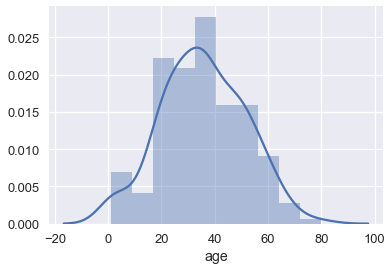
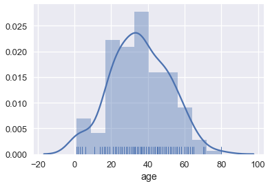
默认情况下,`seaborn`的`distplot`函数将输出一个平滑的曲线,大致拟合分布。 我们还可以添加`rug`绘图,在`x`轴上标记每个点:
```py
sns.distplot(ti['age'], rug=True);
```
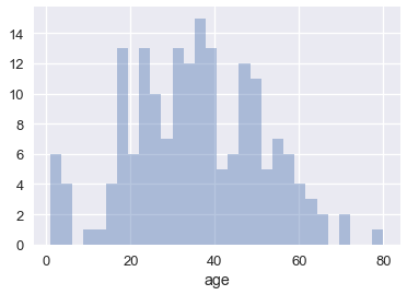
我们也可以绘制分布本身。 调整桶的数量表明船上有许多儿童。
```py
sns.distplot(ti['age'], kde=False, bins=30);
```
### 箱形图
箱形图是查看大部分数据所在位置的便捷方式。 通常,我们使用数据的 25 和 75 百分位数作为箱子的起点和终点,并在箱子内为 50 百分位数(中位数)绘制一条线。 我们绘制两个“胡须”,除了离群点外,它们可以扩展显示剩余数据,离群点数据被标记为胡须外的各个点。
```py
sns.boxplot(x='fare', data=ti);
```
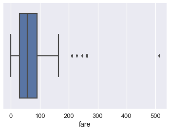
我们通常使用四分位间距(IQR)来确定,哪些点被认为是箱形图的异常值。 IQR 是数据的 75 百分位数与 25 百分位数的差。
```py
lower, upper = np.percentile(ti['fare'], [25, 75])
iqr = upper - lower
iqr
# 60.299999999999997
```
比 75 百分位数大`1.5×IQR`,或者比 25 百分位数小`1.5×IQR`的值,被认为是离群点,我们可以在上面的箱形图中看到,它们被单独标记:
```py
upper_cutoff = upper + 1.5 * iqr
lower_cutoff = lower - 1.5 * iqr
upper_cutoff, lower_cutoff
# (180.44999999999999, -60.749999999999986)
```
虽然直方图一次显示整个分布,但当我们按不同类别分割数据时,箱型图通常更容易理解。 例如,我们可以为每类乘客制作一个箱形图:
```py
sns.boxplot(x='fare', y='who', data=ti);
```
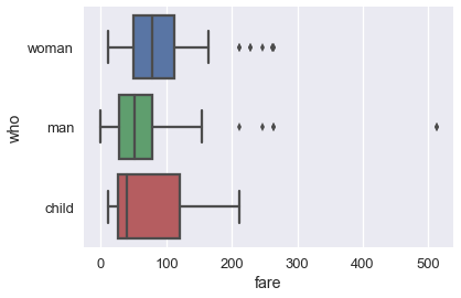
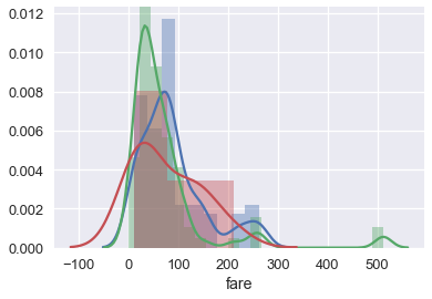
单独的箱形图比下面的重叠直方图更容易理解,它绘制相同数据:
```py
sns.distplot(ti.loc[ti['who'] == 'woman', 'fare'])
sns.distplot(ti.loc[ti['who'] == 'man', 'fare'])
sns.distplot(ti.loc[ti['who'] == 'child', 'fare']);
```
### 使用 Seaborn 的简要注解
你可能已经注意到,为`who`列创建单个箱形图的`boxplot`调用,比制作叠加直方图的等效代码更简单。 虽然`sns.distplot`接受数据数组或序列,但大多数其他`seaborn`函数允许你传入一个`DataFrame`,并指定在`x`和`y`轴上绘制哪一列。 例如:
```py
# Plots the `fare` column of the `ti` DF on the x-axis
sns.boxplot(x='fare', data=ti);
```
当列是类别的时候(`'who'`列包含`'woman'`,`'man'`和`'child'`),`seaborn`会在绘图之前自动按照类别分割数据。 这意味着,我们不必像我们为`sns.distplot`所做的那样,自己过滤掉每个类别。
```py
# fare (numerical) on the x-axis,
# who (nominal) on the y-axis
sns.boxplot(x='fare', y='who', data=ti);
```

### 散点图
散点图用于比较两个定量变量。 我们可以使用散点图比较泰坦尼克号数据集的年龄和票价列。
```py
sns.lmplot(x='age', y='fare', data=ti);
```
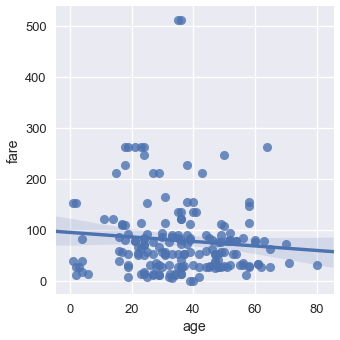
默认情况下,`seaborn`也会使回归直线拟合我们的散点图,并自举散点图,在回归线周围创建 95% 置信区间,如上图中的浅蓝色阴影所示。 这里,回归线似乎不太适合散点图,所以我们可以关闭回归。
```py
sns.lmplot(x='age', y='fare', data=ti, fit_reg=False);
```
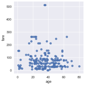
我们可以使用类别变量对点进行着色。 让我们再次使用`who`列:
```py
sns.lmplot(x='age', y='fare', hue='who', data=ti, fit_reg=False);
```

我们可以从这个图中看出,所有年龄在 18 岁左右的乘客都标记为小孩。 虽然两张最贵的门票是男性购买的,但男女乘客票价似乎没有明显的差异。
## 定性数据
对于定性或类别数据,我们通常使用条形图和点图。 我们将展示,如何使用`seaborn`和泰坦尼克号幸存者数据集创建这些绘图。
```py
# Import seaborn and apply its plotting styles
import seaborn as sns
sns.set()
# Load the dataset
ti = sns.load_dataset('titanic').reset_index(drop=True)
# This table is too large to fit onto a page so we'll output sliders to
# pan through different sections.
df_interact(ti)
# (891 rows, 15 columns) total
```
### 条形图
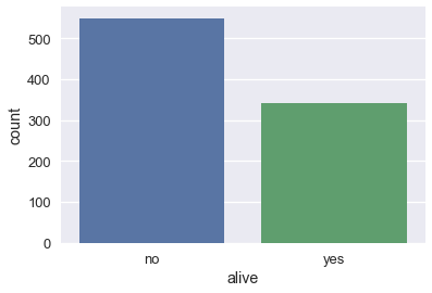
在`seaborn`中,有两种类型的条形图。 第一种使用`countplot`方法来计算每个类别在列中出现的次数。
```py
# Counts how many passengers survived and didn't survive and
# draws bars with corresponding heights
sns.countplot(x='alive', data=ti);
```
```py
sns.countplot(x='class', data=ti);
```

```py
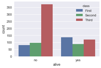
# As with box plots, we can break down each category further using color
sns.countplot(x='alive', hue='class', data=ti);
```
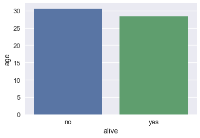
另一方面,`barplot`方法按照类别列对`DataFrame`进行分组,并根据每个组内的数字列的平均值绘制条的高度。
```py
# For each set of alive/not alive passengers, compute and plot the average age.
sns.barplot(x='alive', y='age', data=ti);
```
通过对原始`DataFrame`进行分组,并计算年龄列的平均值,可以计算每个条形的高度:
```py
ti[['alive', 'age']].groupby('alive').mean()
```
| | age |
| --- | --- |
| alive | |
| no | 30.626179 |
| yes | 28.343690 |
默认情况下,`barplot`方法也会为每个平均值,计算自举的 95% 置信区间,在上面的条形图中标记为黑线。 置信区间表明,如果数据集包含泰坦尼克号乘客的随机样本,那么在 5% 的显着性水平下,幸存者和死亡者的年龄差异无统计学意义。
当我们有更大的数据集时,这些置信区间需要很长的时间才能生成,因此有时会关闭它们:
```py
sns.barplot(x='alive', y='age', data=ti, ci=False);
```
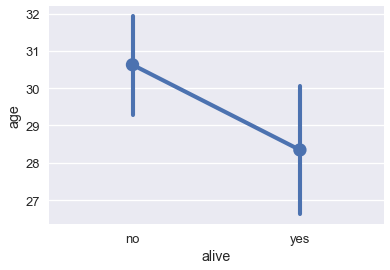
### 点图
点图与条形图类似。 它不是绘制条形图,而是标记条形图末尾处的单个点。 我们使用`pointplot`方法在`seaborn`中制作点图。 与`barplot`方法一样,`pointplot`方法也自动将`DataFrame`分组,并计算每组数值变量的平均值,将 95% 置信区间标记为以每个点为中心的垂直线。
```py
# For each set of alive/not alive passengers, compute and plot the average age.
sns.pointplot(x='alive', y='age', data=ti);
```
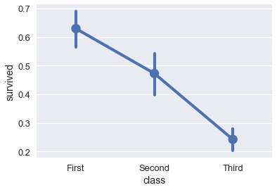
比较跨类别的变化时,点图非常有用:
```py
# Shows the proportion of survivors for each passenger class
sns.pointplot(x='class', y='survived', data=ti);
```
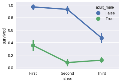
```py
# Shows the proportion of survivors for each passenger class,
# split by whether the passenger was an adult male
sns.pointplot(x='class', y='survived', hue='adult_male', data=ti);
```
## 使用`matplotlib`定制绘图
尽管`seaborn`能让我们快速创建多种类型的绘图,但它并不能让我们细致地控制图表。 例如,我们不能使用`seaborn`来修改绘图的标题,更改`x`或`y`轴标签,或将注释添加到绘图。 相反,我们必须使用`seaborn`所基于的`matplotlib`库。
`matplotlib`提供了基本的积木,用于在 Python 中创建绘图。 虽然它提供了很好的控制权,但它也更加麻烦 - 使用`matplotlib`重新创建之前章节中的`seaborn`绘图需要多行代码。 实际上,我们可以将`seaborn`视为一组有用的快捷方式,用于创建`matplotlib`绘图。 尽管我们更喜欢在`seaborn`中创建绘图的原型,但为了定制绘图以便发布,我们需要学习`matplotlib`的基本部分。
在我们查看第一个简单示例之前,我们必须在笔记本中开启`matplotlib`支持:
```py
# This line allows matplotlib plots to appear as images in the notebook
# instead of in a separate window.
%matplotlib inline
# plt is a commonly used shortcut for matplotlib
import matplotlib.pyplot as plt
```
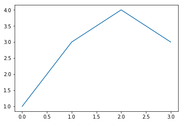
### 定制图表和轴域
为了在`matplotlib`中创建绘图,我们创建图形(Figure),然后在图形中添加一个轴域(Axes)。 在`matplotlib`中,轴域是单个图表,而图形可以在一个表格布局中包含多个轴域。 轴域包含标记,图上绘制的线或补丁。
```py
# Create a figure
f = plt.figure()
# Add an axes to the figure. The second and third arguments create a table
# with 1 row and 1 column. The first argument places the axes in the first
# cell of the table.
ax = f.add_subplot(1, 1, 1)
# Create a line plot on the axes
ax.plot([0, 1, 2, 3], [1, 3, 4, 3])
# Show the plot. This will automatically get called in a Jupyter notebook
# so we'll omit it in future cells
plt.show()
```
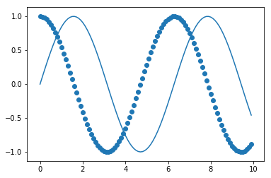
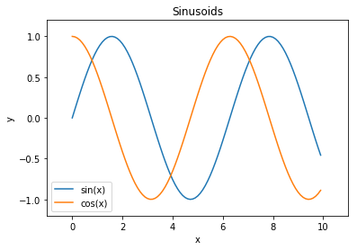
为了自定义绘图,我们可以在轴域对象上使用其他方法:
```py
f = plt.figure()
ax = f.add_subplot(1, 1, 1)
x = np.arange(0, 10, 0.1)
# Setting the label kwarg lets us generate a legend
ax.plot(x, np.sin(x), label='sin(x)')
ax.plot(x, np.cos(x), label='cos(x)')
ax.legend()
ax.set_title('Sinusoids')
ax.set_xlabel('x')
ax.set_ylabel('y');
```
作为一种捷径,`matplotlib`在`plt`模块上提供了绘制方法,会自动初始化图形和轴域。
```py
# Shorthand to create figure and axes and call ax.plot
plt.plot(x, np.sin(x))
# When plt methods are called multiple times in the same cell, the
# existing figure and axes are reused.
plt.scatter(x, np.cos(x));
```
`plt`模块的方法与轴域相似,因此我们可以使用`plt`捷径重新创建其中一个上述的图。
```py
x = np.arange(0, 10, 0.1)
plt.plot(x, np.sin(x), label='sin(x)')
plt.plot(x, np.cos(x), label='cos(x)')
plt.legend()
# Shorthand for ax.set_title
plt.title('Sinusoids')
plt.xlabel('x')
plt.ylabel('y')
# Set the x and y-axis limits
plt.xlim(-1, 11)
plt.ylim(-1.2, 1.2);
```
### 定制标记
为了改变绘图标记本身的属性(例如上图中的线),我们可以将其他参数传递给`plt.plot`。
```py
additional arguments into plt.plot.
plt.plot(x, np.sin(x), linestyle='--', color='purple');
```
查看`matplotlib`文档,是找出哪些参数可用于每种方法的最简单方法。 另一种方法是存储返回的线条对象:
```py
In [1]: line, = plot([1,2,3])
```
这些线条对象有许多可以控制的属性,下面是在 IPython 中使用 Tab 补全的完整列表:
```
In [2]: line.set
line.set line.set_drawstyle line.set_mec
line.set_aa line.set_figure line.set_mew
line.set_agg_filter line.set_fillstyle line.set_mfc
line.set_alpha line.set_gid line.set_mfcalt
line.set_animated line.set_label line.set_ms
line.set_antialiased line.set_linestyle line.set_picker
line.set_axes line.set_linewidth line.set_pickradius
line.set_c line.set_lod line.set_rasterized
line.set_clip_box line.set_ls line.set_snap
line.set_clip_on line.set_lw line.set_solid_capstyle
line.set_clip_path line.set_marker line.set_solid_joinstyle
line.set_color line.set_markeredgecolor line.set_transform
line.set_contains line.set_markeredgewidth line.set_url
line.set_dash_capstyle line.set_markerfacecolor line.set_visible
line.set_dashes line.set_markerfacecoloralt line.set_xdata
line.set_dash_joinstyle line.set_markersize line.set_ydata
line.set_data line.set_markevery line.set_zorder
```
但是`setp`调用(设置属性的缩写)可能非常有用,尤其是在交互式工作时,因为它支持自检,所以你可以在工作时了解有效的调用:
```
In [7]: line, = plot([1,2,3])
In [8]: setp(line, 'linestyle')
linestyle: [ ``'-'`` | ``'--'`` | ``'-.'`` | ``':'`` | ``'None'`` | ``' '`` | ``''`` ] and any drawstyle in combination with a linestyle, e.g. ``'steps--'``.
In [9]: setp(line)
agg_filter: unknown
alpha: float (0.0 transparent through 1.0 opaque)
animated: [True | False]
antialiased or aa: [True | False]
...
... much more output omitted
...
```
在第一种形式中,它向你显示`'linestyle'`属性的有效值,并在第二种形式中向你显示,可以在线条对象上设置的所有可接受属性。 这使得你可以轻松发现,如何定制图形来获得你所需的视觉效果。
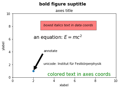
### 任意文本和 LaTeX 支持
在`matplotlib`中,可以相对于单独的轴对象或整个图形添加文本。
这些命令将文本添加到轴域:
+ `set_title()` - 添加标题
+ `set_xlabel()` - 向 x 轴添加轴标签
+ `set_ylabel()` - 向 y 轴添加轴标签
+ `text()` - 在任意位置添加文本
+ `annotate()` - 添加注解,带有可选的箭头
以及这些作用于整个图形:
+ `figtext()` - 在任意位置添加文本
+ `suptitle()` - 添加标题
并且任何文本字段都可以包含用于数学的 LaTeX 表达式,只要它们包含在`$`符号中即可。
这个例子演示了所有这些:
```py
fig = plt.figure()
fig.suptitle('bold figure suptitle', fontsize=14, fontweight='bold')
ax = fig.add_subplot(1, 1, 1)
fig.subplots_adjust(top=0.85)
ax.set_title('axes title')
ax.set_xlabel('xlabel')
ax.set_ylabel('ylabel')
ax.text(3, 8, 'boxed italics text in data coords', style='italic',
bbox={'facecolor':'red', 'alpha':0.5, 'pad':10})
ax.text(2, 6, 'an equation: $E=mc^2$', fontsize=15)
ax.text(3, 2, 'unicode: Institut für Festkörperphysik')
ax.text(0.95, 0.01, 'colored text in axes coords',
verticalalignment='bottom', horizontalalignment='right',
transform=ax.transAxes,
color='green', fontsize=15)
ax.plot([2], [1], 'o')
ax.annotate('annotate', xy=(2, 1), xytext=(3, 4),
arrowprops=dict(facecolor='black', shrink=0.05))
ax.axis([0, 10, 0, 10]);
```
### 使用`matplotlib`定制`seaborn`绘图
既然我们已经看到了如何使用`matplotlib`来定制绘图,我们可以使用相同的方法来定制`seaborn`绘图,因为`seaborn`在背后使用`matplotlib`创建了绘图。
```py
# Load seaborn
import seaborn as sns
sns.set()
sns.set_context('talk')
# Load dataset
ti = sns.load_dataset('titanic').dropna().reset_index(drop=True)
ti.head()
```
| | survived | pclass | sex | age | ... | deck | embark_town | alive | alone |
| --- | --- | --- | --- | --- | --- | --- | --- | --- | --- |
| 0 | 1 | 1 | female | 38.0 | ... | C | Cherbourg | yes | False |
| 1 | 1 | 1 | female | 35.0 | ... | C | Southampton | yes | False |
| 2 | 0 | 1 | male | 54.0 | ... | E | Southampton | no | True |
| 3 | 1 | 3 | female | 4.0 | ... | G | Southampton | yes | False |
| 4 | 1 | 1 | female | 58.0 | ... | C | Southampton | yes | True |
5 rows × 15 columns
我们以这个绘图开始:
```py
sns.lmplot(x='age', y='fare', hue='who', data=ti, fit_reg=False);
```

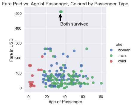
我们可以看到,该图需要标题和更好的`x`和`y`轴标签。 另外,票价最高的两个人幸存了下来,所以我们可以在我们的绘图中注明他们。
```py
sns.lmplot(x='age', y='fare', hue='who', data=ti, fit_reg=False)
plt.title('Fare Paid vs. Age of Passenger, Colored by Passenger Type')
plt.xlabel('Age of Passenger')
plt.ylabel('Fare in USD')
plt.annotate('Both survived', xy=(35, 500), xytext=(35, 420),
arrowprops=dict(facecolor='black', shrink=0.05));
```
在实践中,我们使用`seaborn`快速探索数据,然后一旦我们决定在论文或展示中使用这些图,转向`matplotlib`以便调优。
## 可视化的原则
现在我们有了创建和更改绘图的工具,现在我们转向数据可视化的关键原则。 与数据科学的其他部分非常相似,很难准确地用一个数字来衡量特定可视化的效率。 尽管如此,还是有一些通用原则,可以使可视化更有效地显示数据趋势。 我们讨论了六类原则:尺度,条件,感知,转换,上下文和平滑。
### 尺度原则
尺度原则与涉及用于绘制数据的`x`和`y`轴的选择。
在 2015 年的美国国会听证会上,Chaffetz 代表讨论了计划生育项目的调查。 他展示了以下绘图,最初出现在美国生命联合会的一篇报告中。 它比较了堕胎和癌症筛查程序的数量,两者都是由计划生育提供的。 (完整报告可在 <https://oversight.house.gov/interactivepage/plannedparenthood> 查阅。)
这个绘图有什么疑点?它绘制了多少个数据点?

这个绘图违反了尺度原则;它没有很好选择其`x`和`y`轴。
当我们为我们的绘图选择`x`轴和`y`轴时,我们应该在整个轴上保持一致的尺度。 然而,上图用于堕胎和癌症筛查的线条具有不同的尺度 - 堕胎的线条的起点和癌症筛查线条的终点在`y`轴上彼此接近,但代表了大不相同的数字。 此外,仅绘制了 2006 年和 2013 年的点数,但`x`轴包含之间的每年的不必要的刻度线。
为了改善这个绘图,我们应该在相同的`y`轴尺度上重新绘制相同的点:
```py
# HIDDEN
pp = pd.read_csv("data/plannedparenthood.csv")
plt.plot(pp['year'], pp['screening'], linestyle="solid", marker="o", label='Cancer')
plt.plot(pp['year'], pp['abortion'], linestyle="solid", marker="o", label='Abortion')
plt.title('Planned Parenthood Procedures')
plt.xlabel("Year")
plt.ylabel("Service")
plt.xticks([2006, 2013])
plt.legend();
```
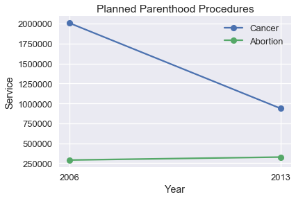
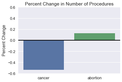
我们可以看到,与癌症筛查数量的大幅下降相比,堕胎数量的变化非常小。 我们可能会对数量变化的百分比感兴趣,而不是过程的数量。
```py
# HIDDEN
percent_change = pd.DataFrame({
'percent_change': [
pp['screening'].iloc[1] / pp['screening'].iloc[0] - 1,
pp['abortion'].iloc[1] / pp['abortion'].iloc[0] - 1,
],
'procedure': ['cancer', 'abortion'],
'type': ['percent_change', 'percent_change'],
})
ax = sns.barplot(x='procedure', y='percent_change', data=percent_change)
plt.title('Percent Change in Number of Procedures')
plt.xlabel('')
plt.ylabel('Percent Change')
plt.ylim(-0.6, 0.6)
plt.axhline(y=0, c='black');
```
选择`x`轴和`y`轴的限制时,我们倾向于重点关注带有大部分数据的区域,特别是在处理长尾数据时。 考虑以下绘图,它的放大版本在右侧:

右图更有助于理解数据集。 如果需要,我们可以对数据的不同区域绘制多个图,来显示整个数据范围。 在本节的后面,我们讨论数据转换,这也有助于可视化长尾数据。
### 条件原则
条件原则为我们提供了技巧,来展示我们数据的子组之间的分布和关系。
美国劳工统计局负责监督与美国经济健康有关的科学调查。 他们的网站包含一个工具,使用这些数据生成报告。数据用于生成这个图表,它比较了每周收入的中位数,按性别分组。
使用这种绘图,最容易实现哪些比较? 它们是最有趣或最重要的比较嘛?
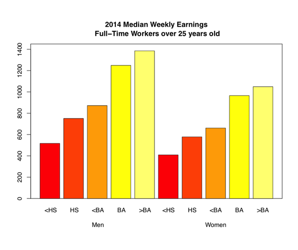
这个绘图让我们一眼就看到,随着教育水平提高,每周收入会增加。 然而,很难准确地确定,对于每种教育水平收入增加的程度,在相同的教育水平上,比较男性和女性的每周收入甚至更加困难。 我们可以通过使用点图而不是条形图来发现这两种趋势。
```py
# HIDDEN
cps = pd.read_csv("data/edInc2.csv")
ax = sns.pointplot(x="educ", y="income", hue="gender", data=cps)
ticks = ["<HS", "HS", "<BA", "BA", ">BA"]
ax.set_xticklabels(ticks)
ax.set_xlabel("Education")
ax.set_ylabel("Income")
ax.set_title("2014 Median Weekly Earnings\nFull-Time Workers over 25 years old");
```
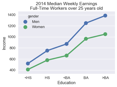
连接点的线条更清晰地表明,本科学位的每周收入相对较大。 将男性和女性的数值直接放在一起,可以更容易地看出,随着教育水平的提高,男性和女性之间的工资差距趋于增加。
为了有助于比较数据中的两个子组,请沿`x`或`y`轴对齐标记,并为不同的子组使用不同的颜色或标记。 线条比条形更倾向于显示数据的趋势,对于序数和数值数据都是有用的选择。
### 感知原则
人类感知具有特定属性,在可视化设计中考虑它们十分重要。 人类感知的第一个重要属性是,比起其它颜色,我们更强烈地感知某些颜色,尤其是绿色。 此外我们认为,较浅的阴影区域比较深的阴影区域大。 例如,在我们刚刚讨论的每周收入图中,较浅的条形似乎比较深的条形吸引更多注意力:

实际上,你应该确保图表的调色板在感知上是统一的。 这意味着,例如,条形图中条形之间的颜色的感知强度不会发生变化。 对于定量数据,你有两种选择:如果你的数据从低到高排列,并且你想强调较大的值,则使用顺序配色方案,将较浅的颜色分配给较大的值。 如果应该强调低值和高值,则使用分色配色方案,将更浓的颜色分配给更接近中心的值。
`seaborn `内置了许多有用的调色板。 你可以浏览其文档来了解如何在调色板之间切换:<http://seaborn.pydata.org/tutorial/color_palettes.html>
人类感知的第二个重要属性是,当我们比较长度时,我们通常更准确,当比较面积时我们更不准确。 考虑下面的非洲国家的 GDP 图。
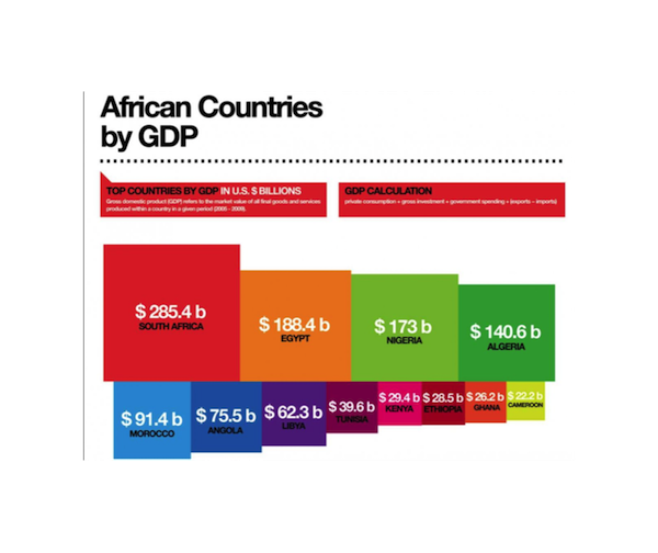
按数值计算,南非的 GDP 是阿尔及利亚的两倍,但从上面的绘图来看并不容易分辨。 相反,我们可以在点图上绘制 GDP:
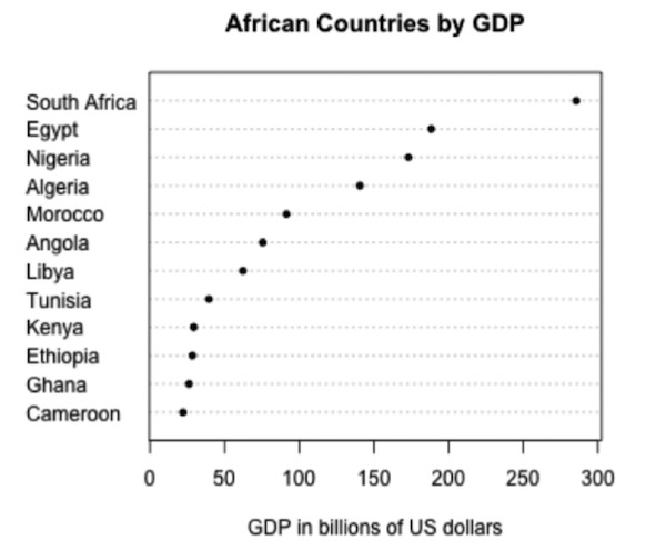
这更清晰,因为它使我们能够比较长度而不是面积。出于相同的原因,饼图和三维图很难解释;我们倾向于在实践中避免使用这些图表。
人类感知的第三个也是最后一个属性是,人眼在改变基线方面存在困难。 考虑以下的层叠面积图,绘制随时间变化的二氧化碳排放量,按国家分组。
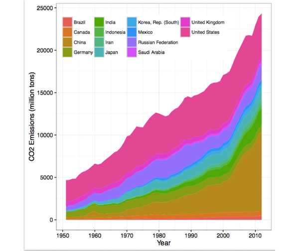
观察英国的排放量随时间增加或减少是很困难的,由于基线摆动问题:该面积的基线上下摆动。 当两个高度相似时(例如 2000 年),英国的排放量是否大于中国的排放量,也难以比较。
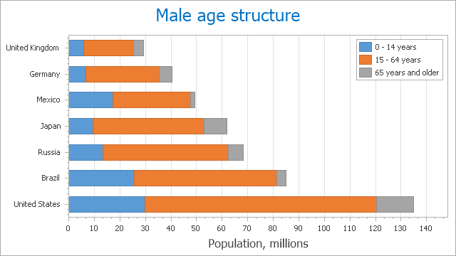
层叠条形图中出现类似的基线摆动问题。 在下面的图中,很难比较德国和墨西哥的 15-64 岁的人数。
我们通常可以通过切换为折线图,来改善层叠面积或条形图。 以下是随时间变化的排放量数据,绘制成线条而不是面积:
```py
# HIDDEN
co2 = pd.read_csv("data/CAITcountryCO2.csv", skiprows = 2,
names = ["Country", "Year", "CO2"])
last_year = co2.Year.iloc[-1]
q = f"Country != 'World' and Country != 'European Union (15)' and Year == {last_year}"
top14_lasty = co2.query(q).sort_values('CO2', ascending=False).iloc[:14]
top14 = co2[co2.Country.isin(top14_lasty.Country) & (co2.Year >= 1950)]
from cycler import cycler
linestyles = (['-', '--', ':', '-.']*3)[:7]
colors = sns.color_palette('colorblind')[:4]
lines_c = cycler('linestyle', linestyles)
color_c = cycler('color', colors)
fig, ax = plt.subplots(figsize=(9, 9))
ax.set_prop_cycle(lines_c * color_c)
x, y ='Year', 'CO2'
for name, df in top14.groupby('Country'):
ax.semilogy(df[x], df[y], label=name)
ax.set_xlabel(x)
ax.set_ylabel(y + "Emissions [Million Tons]")
ax.legend(ncol=2, frameon=True);
```
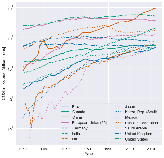
这个绘图并不会改动基线,因此比较国家间的排放量更容易。 我们也可以更清楚地看到,哪些国家的排放量增加最多。
### 转换原则
数据转换的原则为我们提供了实用方法,来转换可视化数据,以便更有效地揭示趋势。 我们通常应用数据转换来揭示偏斜数据中的模式,和变量之间的非线性关系。
下图显示了泰坦尼克号上每位乘客的票价分布。 正如你所看到的,分布是左偏的。
```py
# HIDDEN
ti = sns.load_dataset('titanic')
sns.distplot(ti['fare'])
plt.title('Fares for Titanic Passengers')
plt.xlabel('Fare in USD')
plt.ylabel('Density');
```
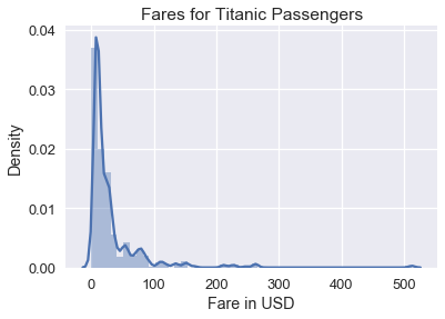
虽然此直方图显示所有票价,但由于票价聚集在直方图的左侧,因此很难在数据中看到详细模式。 为了解决这个问题,我们可以在绘制票价之前对票价取自然对数:
```py
# HIDDEN
sns.distplot(np.log(ti.loc[ti['fare'] > 0, 'fare']), bins=25)
plt.title('log(Fares) for Titanic Passengers')
plt.xlabel('log(Fare) in USD')
plt.ylabel('Density');
```
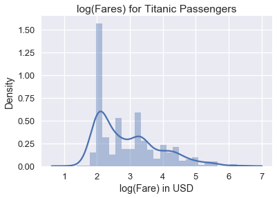
我们可以从对数数据图中看到,票价分布的众数大致为 $e^2 = 7.40$ 美元,较小的众数为大约 $e^{3.4} = 30.00$ 美元。 为什么绘制数据的自然对数有助于避免偏斜? 较大数的对数趋于接近较小数的对数:
| 值 | 对数值 |
| --- | --- |
| 1 | 0.00 |
| 10 | 2.30 |
| 50 | 3.91 |
| 100 | 4.60 |
| 500 | 6.21 |
| 1000 | 6.90 |
- 一、数据科学的生命周期
- 二、数据生成
- 三、处理表格数据
- 四、数据清理
- 五、探索性数据分析
- 六、数据可视化
- Web 技术
- 超文本传输协议
- 处理文本
- python 字符串方法
- 正则表达式
- regex 和 python
- 关系数据库和 SQL
- 关系模型
- SQL
- SQL 连接
- 建模与估计
- 模型
- 损失函数
- 绝对损失和 Huber 损失
- 梯度下降与数值优化
- 使用程序最小化损失
- 梯度下降
- 凸性
- 随机梯度下降法
- 概率与泛化
- 随机变量
- 期望和方差
- 风险
- 线性模型
- 预测小费金额
- 用梯度下降拟合线性模型
- 多元线性回归
- 最小二乘-几何透视
- 线性回归案例研究
- 特征工程
- 沃尔玛数据集
- 预测冰淇淋评级
- 偏方差权衡
- 风险和损失最小化
- 模型偏差和方差
- 交叉验证
- 正规化
- 正则化直觉
- L2 正则化:岭回归
- L1 正则化:LASSO 回归
- 分类
- 概率回归
- Logistic 模型
- Logistic 模型的损失函数
- 使用逻辑回归
- 经验概率分布的近似
- 拟合 Logistic 模型
- 评估 Logistic 模型
- 多类分类
- 统计推断
- 假设检验和置信区间
- 置换检验
- 线性回归的自举(真系数的推断)
- 学生化自举
- P-HACKING
- 向量空间回顾
- 参考表
- Pandas
- Seaborn
- Matplotlib
- Scikit Learn